
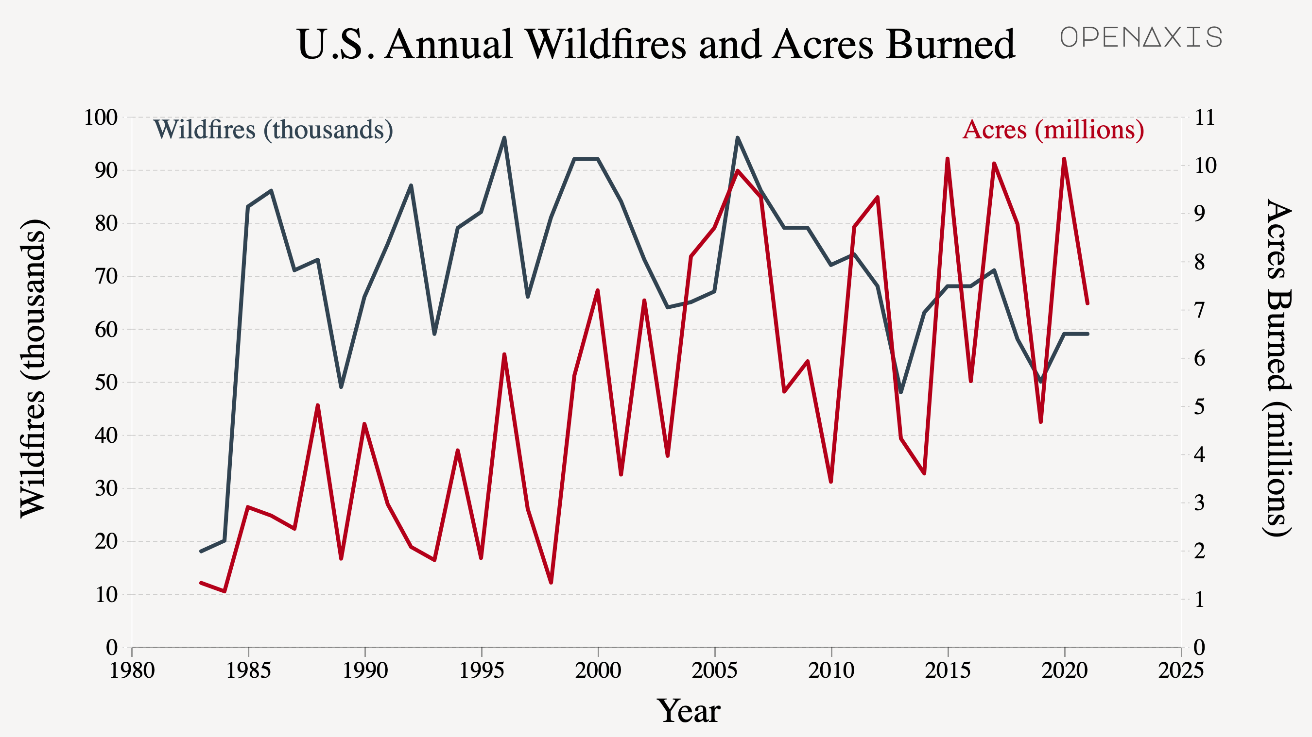
This is a recreation of a graph from the Congressional Research Service's Wildfire Statistics report. Wildfires are "unplanned fires, including lightning-caused fires, unauthorized human-caused fires, and escaped prescribed fire projects." The data indicates that the number of annual wildfires, albeit variable, has decreased slightly over the last 30 years. In contrast, there is a general increase in the total number of acres burned annually.
What are your thoughts on using two y-axes of different scales?
Source: National Interagency Coordination Center
What would be the cause of the increase in "intensity" (acres burned) of these wildfires over time?